Every Interface Designed with Precision: UI/UX Design Principles That Convert
Learn the UI/UX design principles behind interfaces people enjoy using: research, clarity, consistency and accessibility. Turn more visitors into customers.
In this article
- Why UI/UX design matters for your business
- Principle 1: Start with user research
- Principle 2: Make the next step obvious
- Principle 3: Stay consistent across every screen
- Principle 4: Design for accessibility from day one
- Principle 5: Design mobile-first
- Principle 6: Prototype, test and iterate
- Final thoughts: precision comes from process
Good UI/UX design principles are what separate an interface people enjoy using from one they abandon after a few seconds. They come down to understanding your users, making the next step obvious, staying consistent and making sure everyone can use what you build. This guide breaks down the principles that matter most for websites and apps in 2026, and how to apply them to your own product.
Key takeaways
- Design decisions should come from user research and real behavior data, not guesswork.
- Clarity and consistency reduce friction and build trust, which directly supports conversions.
- Accessibility is a core design requirement, not an afterthought.
- Prototyping and testing early is far cheaper than fixing problems after launch.
Why UI/UX design matters for your business
Every website and app is trying to get someone to do something: book an appointment, request a quote, place an order or sign up. UX design makes that path easy to follow. UI design makes it clear, attractive and trustworthy along the way.
When design works, visitors find what they need, feel confident and take action. When it fails, they hesitate, get confused or leave. That shows up as abandoned carts, unfinished forms and fewer calls. Poor experiences also damage brand perception, even when the product itself is excellent.
For local and small businesses, the stakes are very concrete. When GPITech redesigned the website for TruCutz, a Miami barbershop, clearer booking paths contributed to a 32% increase in appointment bookings and a 45% improvement in website-to-booking conversion. Results vary by business, but the pattern is consistent: clarity pays.
Principle 1: Start with user research
Design that begins with assumptions usually ends with expensive revisions. User research grounds decisions in what people actually need.
Combine qualitative and quantitative insight
- Analytics show what people do: where they land, where they drop off and which devices they use.
- Session recordings and heatmaps show how they interact with a page.
- Interviews and surveys explain why they behave that way.
- Usability tests reveal where people get stuck when trying to complete a real task.
Turn research into personas and journeys
Summarize findings into a few simple personas and map their key journeys, such as "first-time visitor wants to book a haircut" or "returning customer wants to reorder." Each journey highlights pain points and opportunities to remove friction.
Principle 2: Make the next step obvious
Users should never have to wonder what to do next. Strong interfaces guide attention deliberately.
- Clear visual hierarchy. The most important element on each screen should stand out through size, contrast and position.
- One primary action per screen. Secondary options can exist, but they should not compete with the main call to action.
- Plain, specific labels. "Book your appointment" is better than "Submit." "See pricing" is better than "Learn more."
- Short forms. Ask only for what you need right now. Every extra field adds friction.
- Immediate feedback. Buttons, forms and loading states should confirm that something happened.
Principle 3: Stay consistent across every screen
Consistency builds familiarity, and familiarity builds trust. When elements look and behave the same way everywhere, users learn your interface once and move through it confidently.
Use a design system
A design system defines reusable components such as buttons, form fields, cards and navigation, along with rules for color, spacing and typography. Tools like Figma make it easier for designers and developers to share the same source of truth.
Follow familiar patterns
Users bring expectations from every other site and app they use. A cart icon, a hamburger menu on mobile and a logo that links home are conventions for a reason. Reinventing them usually slows people down.
Keep language consistent
If you call it "Sign in" on one screen, do not call it "Log in" on another. Small inconsistencies make a product feel less polished and can confuse users.
Principle 4: Design for accessibility from day one
Accessible design makes your product usable by people with visual, motor, hearing or cognitive impairments, and it improves the experience for everyone. It also reduces legal risk and widens your audience.
| Area | What to do |
|---|---|
| Color and contrast | Use sufficient contrast between text and background, and never rely on color alone to convey meaning |
| Typography | Use legible fonts and sizes, and make sure text can be resized without breaking layouts |
| Structure | Use proper headings so screen readers can navigate the content |
| Keyboard access | Make every interactive element reachable and usable with a keyboard |
| Images and media | Add meaningful alt text, captions and transcripts |
| Touch targets | Make buttons and links large enough to tap comfortably on mobile |
Following recognized accessibility guidelines such as WCAG gives your team a clear, testable standard to work toward.
Principle 5: Design mobile-first
For most businesses, a large share of visitors arrive on a phone. Designing for small screens first forces you to prioritize what matters and keeps layouts focused.
- Put key actions, such as call, book or order, within easy thumb reach.
- Keep pages fast, because slow loading on mobile networks is a common reason visitors leave.
- Test on real devices, not just a resized desktop browser.
- Make sure native mobile apps follow platform conventions on iOS and Android.
If you are deciding whether your business needs a dedicated app or a strong mobile website, our guide on whether a mobile app makes sense for a small business walks through the trade-offs.
Principle 6: Prototype, test and iterate
The cheapest time to fix a design problem is before any code is written.
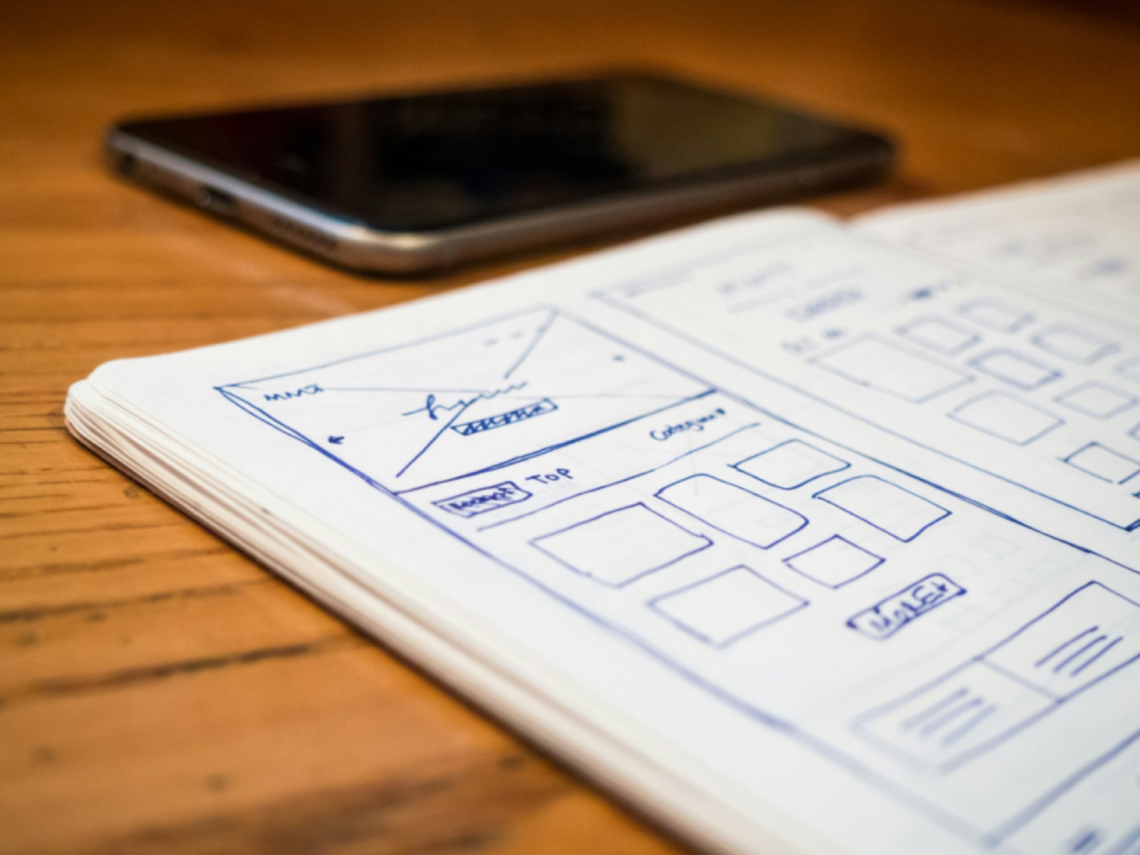
- Wireframes define structure and content without visual detail.
- Interactive prototypes let stakeholders and test users click through real flows.
- Usability testing with a handful of real users often uncovers the most serious issues.
- Launch and measure with analytics and feedback tools.
- Iterate based on what the data shows, not on opinions alone.
Design is never truly finished. The best products improve continuously as you learn more about your users.
A quick self-audit
You can check your own site or app against these UI/UX design principles in under an hour. Open it on your phone and try to complete your most important task, such as booking or requesting a quote, as if you were a first-time visitor. Note every moment you hesitate, every unclear label and every extra tap. Then ask two or three people outside your business to do the same while you watch without helping. The patterns you see will tell you where to start.
How GPITech applies these principles
UI/UX design is one of GPITech's core services, alongside high-converting websites and custom web and mobile apps. Our process follows the same principles described above: understand your customers and goals, map the key journeys, design and prototype, test, then build with developers so the final product matches the design across every device.
You can explore more examples in our portfolio of websites and apps, or review the full range of web, app and design services we offer.
Final thoughts: precision comes from process
Interfaces that feel effortless are rarely an accident. They come from applying UI/UX design principles consistently: research, clarity, consistency, accessibility, mobile-first thinking and continuous testing. Apply even a few of these to your current site or app, and you will likely see where friction has been costing you customers.
When you are ready to improve your website or app, you can get an instant project estimate and see what a redesign or new build might involve.
Frequently asked questions
What is the difference between UI and UX design?
UX design is about the whole experience: whether people can find what they need, understand it and complete their goal easily. UI design is the visual and interactive layer: layout, typography, color, buttons and feedback. Good products need both, because a beautiful interface cannot fix a confusing flow, and a smart flow still fails if the screens are hard to read.
How long does a UI/UX design project take?
It depends on scope. Redesigning a few key pages of a small business website may take a couple of weeks, while designing a full mobile app with research, prototyping and testing usually takes longer. The biggest factors are the number of screens, the amount of research needed and how quickly feedback and approvals happen.
Do small businesses really need UX design?
Yes, though it does not have to be a large project. For a small business, UX design usually means making sure visitors can quickly understand what you offer, trust you and take action, such as booking, calling or ordering. Small improvements to clarity and mobile usability often have a noticeable effect on leads and sales.
What tools do UI/UX designers use?
Common tools include Figma for interface design and prototyping, collaborative whiteboards for mapping user flows, analytics platforms to understand behavior, and session recording or user testing tools to see how real people use a product. The tools matter less than the process of researching, testing and refining based on evidence.
Written by
Sabrine Mejri
Senior Graphic Designer, GPITech
Sabrine Mejri is a senior graphic designer at GPITech, shaping the visual identity and interface design of client websites and apps. Sabrine writes about UI/UX and design that turns visitors into customers.
Connect on LinkedInReady to put this into practice?
Get an instant estimate for your project in under a minute, or book a free strategy call with our team.
Keep reading

How Much Does a Small Business Website Cost in 2026? A Plain-English Pricing Guide
Small business website cost explained: DIY builders vs freelancers vs agencies, ongoing fees, and typical price ranges so you can budget with confidence.

Does Your Small Business Need a Mobile App? An Honest Guide for Owners
Thinking about a mobile app for small business growth? Learn when an app pays off, when a mobile-first website is smarter, and what it costs to build one.

HVAC Website Design That Generates Leads: Pages, Features, and a Real Example
HVAC website design that turns visitors into service calls: must-have pages, emergency CTAs, financing, reviews, and online booking that win you more jobs.